Journal · Craft
What are the most common interior photography mistakes?
The most common interior photography mistakes are leaning verticals, windows that burn out to white, clashing colours from mixed lighting, a lens so wide it stretches the room, and clutter left in the frame. Nearly all of them come from where the camera is put and how the light is handled on the day, so they are fixable, and if you would rather hand the job over my rates start at £700 for up to 20 finished images.
Craft
Leaning walls and the wrong camera height
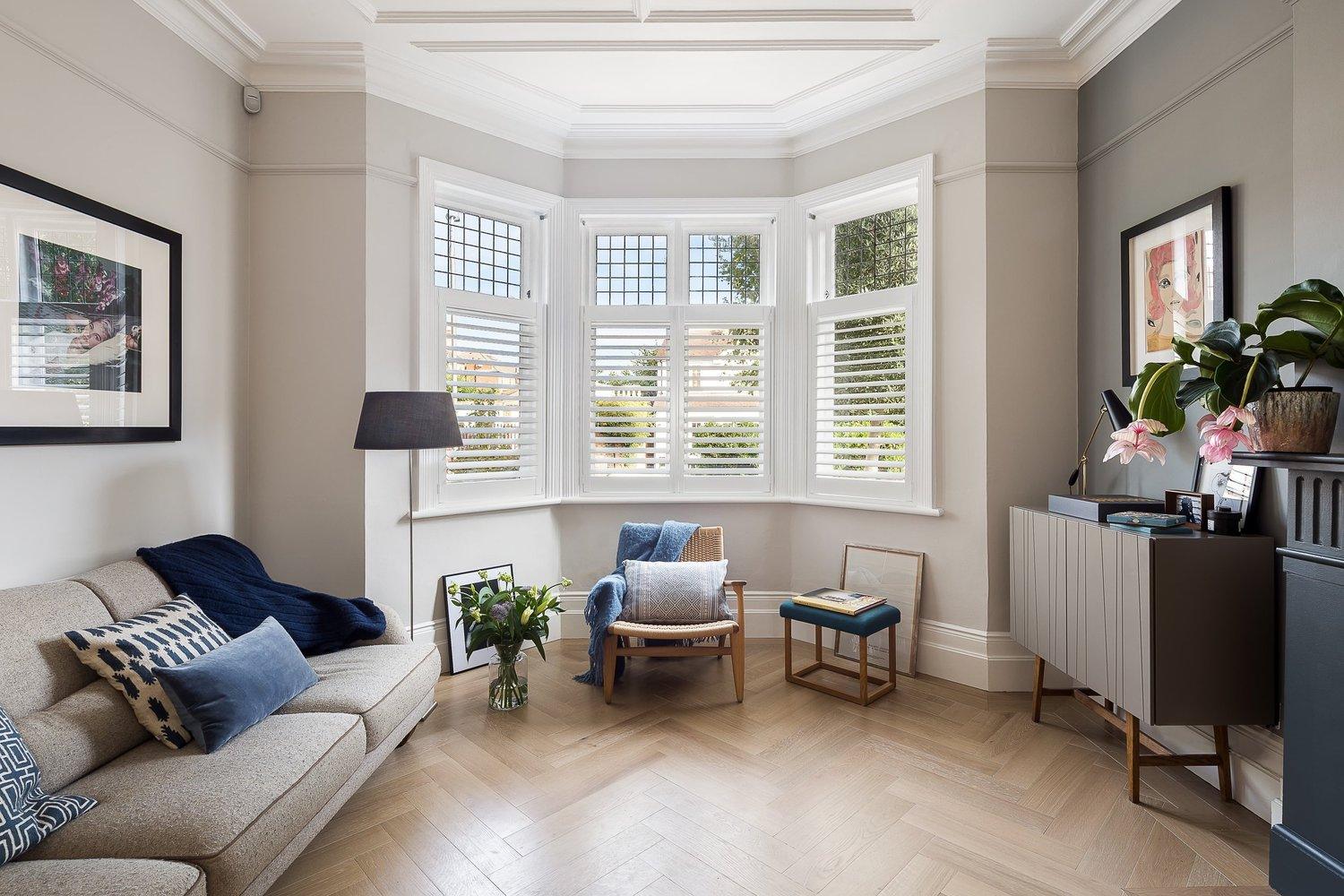
Leaning verticals. This is the one I notice first in most self-shot interiors. When the camera is tipped up to get the ceiling in, or tipped down to get more of the floor, the walls and door frames stop running straight up the picture and lean in or out instead. Most people looking at the photo could not name the problem, though they can usually tell the room looks slightly off. My fix starts on site. I level the camera on a tripod and use a shift lens, which moves the view up or down without tilting the camera, so the verticals stay parallel. Whatever small error is left gets corrected afterwards, and that side of it is covered in what architectural retouching includes.
Shooting from too high or too low. Standing up and shooting from eye level tends to show the tops of every table and desk and makes furniture look squat. Crouching down does the opposite, so the ceiling looms and the floor takes over the bottom half of the frame. For most rooms I start with the camera somewhere around worktop height or a little above and adjust from there. A lounge with low seating usually wants it a bit lower. Keeping the camera level at that height also does a lot of the work on the verticals.
Craft
A lens so wide it stretches the room
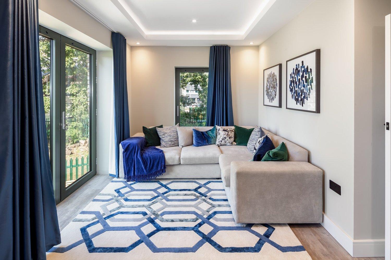
With a small room the temptation is to go as wide as the lens or the phone allows and back into a corner until everything fits. It does fit, but the near corners stretch, round tables at the edges go oval, and the room looks bigger in the photo than it is. Anyone who visits after seeing the pictures notices, which matters if you are the designer or the agent whose name is on them.
I use a lens wide enough to show the space roughly as it feels when you stand in it. If a room needs more than that, it gets a second setup from the other end rather than one frame that tries to show all four walls at once.
Craft
White windows and colours that do not match
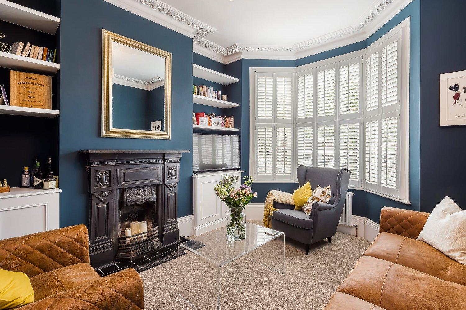
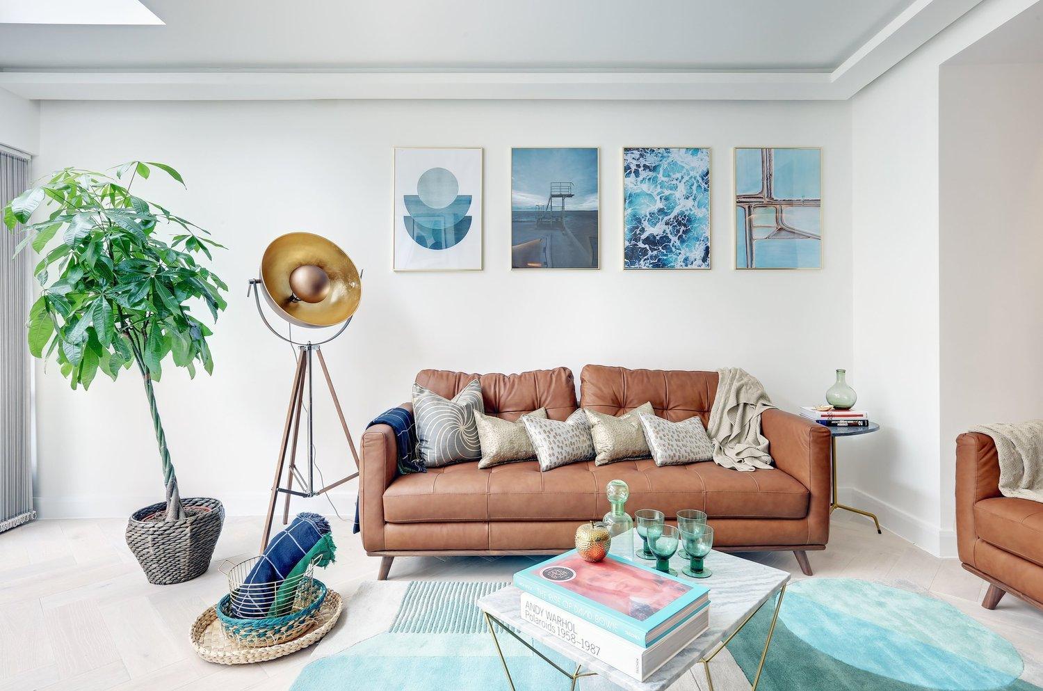
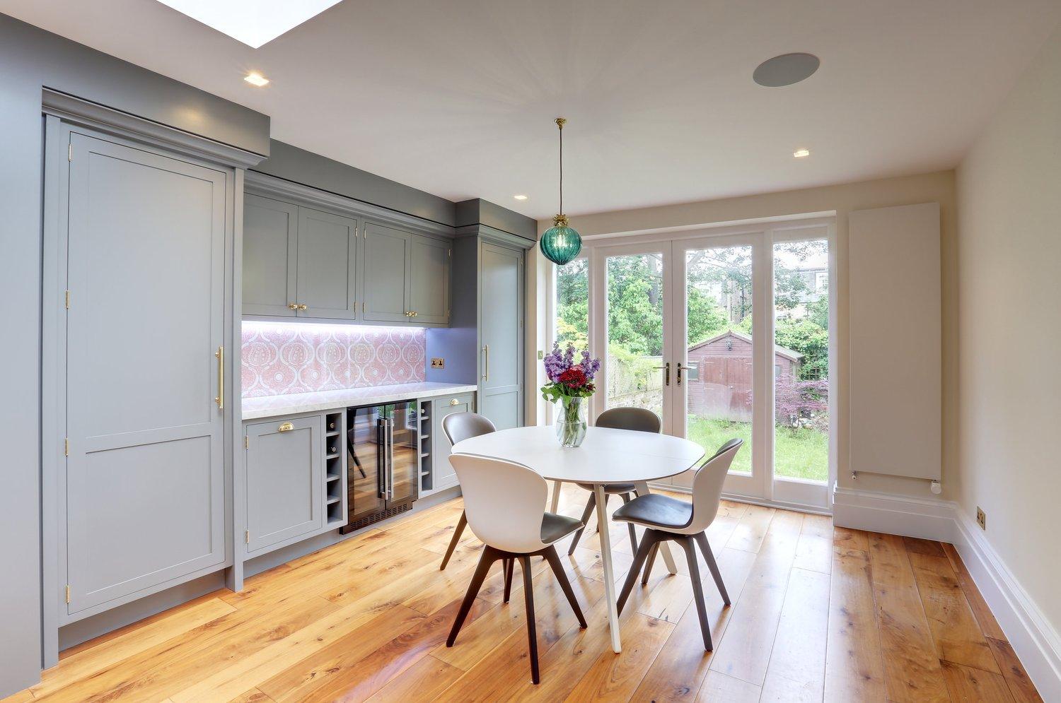
Blown-out windows. A camera cannot hold a bright window and the room around it in one exposure. Expose for the room and the glass goes white, expose for the view and the room drops into shadow. Phones try to sort this out automatically, and the result can look flat and grey with faint halos round the window frames. I bracket each view from a locked-off tripod, taking several exposures from dark to bright, and blend them afterwards so the room and the view outside both read properly.
Mixed colour temperatures. Most rooms are lit by daylight from the windows plus warm lamps and LED downlights, and each of those can be a slightly different colour. Your eye adjusts and a camera does not, so one frame can come out orange near the lamps and blue by the window. Part of the answer is deciding which lights to keep on, and the rest is correcting each area of the frame separately afterwards instead of with one overall adjustment. I have written about both problems at more length in the post on light in architectural photography, so I will not go over them again here.
Craft
Lights all on, or all off
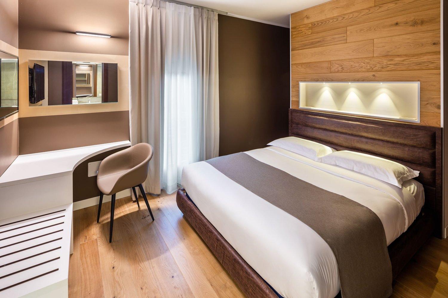
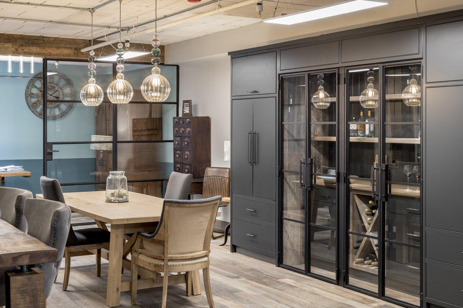
A lot of self-shot interiors have every light switched on because it seemed brighter, or every light off because someone read that daylight is best. Neither works as a rule. With everything on, ceiling downlights tend to throw hot spots onto the walls and add another colour to the mix. With everything off, a room that was designed around its lamps and feature lighting looks flat and darker than it is.
I decide room by room. Usually the pendants, lamps and any feature lighting the designer specified stay on, because they are part of the design, while downlights that clash with the daylight get dimmed or switched off. Where a room is still too dark, I add supplementary lighting and set it so it reads as the room's own light rather than a flash. It helps to have someone on site who knows which switch controls which circuit.
Craft
Clutter and the small things that pull the eye
Clutter is the most common mistake of all and the cheapest to avoid. In offices it is usually cables across desks, chairs left at different heights, a bin beside reception and blinds set at different levels along a row of windows. In homes and show flats it tends to be phone chargers, remote controls, tea towels and the odd pair of shoes by the door. It is easy to stop seeing it in a space you use every day, but it shows clearly in a photograph.
On my shoots tidying is part of every setup, and it is one reason a considered interior frame often takes thirty to forty minutes. Anything that cannot be moved on the day can usually be removed afterwards, but heavier clean-ups are charged at £50 an hour, so it is almost always cheaper to clear it first. There is a full list of what to sort out in how to prepare a building for a photoshoot.
Craft
Too many frames of the same thing
When people photograph their own projects they often come back with forty pictures of the same three rooms, each taken a step to the left of the last, and the set says less than a dozen distinct views would. Each frame in a good interior set has a job, usually a wide that explains the room and how it leads into the next space, then one or two details of the materials or joinery the designer cared most about.
That is how I plan a shoot. A half day usually covers a handful of considered setups rather than a large number of quick frames. Afterwards you get a PDF contact sheet of every frame that made it past the cull, four previews to an A4 page, so you are choosing between different views instead of ten versions of the same corner. If you are judging a photographer rather than your own pictures, the same list works as a checklist. Look through a full project gallery for leaning walls, white windows and colour that shifts from one frame to the next.
Craft
When a phone is good enough
A phone is fine for more jobs than people expect. For snagging, a progress update to a client, a quick social post or showing a supplier how their product was installed, a recent phone does the job and paying a photographer would be poor value. If you use one, hold it level, stand back from the corner rather than wedging yourself into it, use the main lens instead of the ultra-wide, tidy the frame first and pick a bright overcast day if you have the choice. That deals with most of the mistakes above.
Where a phone falls short is work that gets looked at closely and kept for years, such as a portfolio, an awards entry, press, a tender or the main images on your website. That is where leaning lines, grey windows and odd colour get noticed. My rates are £700 for up to 20 finished images with up to 3 hours on site, or £1,200 for up to 40 with up to 6 hours, with retouching and travel within London Zones 1 to 4 included. The full breakdown is on the rates and licensing page.
Common questions
Frequently asked
What mistakes do people make when photographing interiors?
The most common are tilting the camera so walls lean, letting windows burn out to white, mixing light sources of different colours, using a lens so wide it stretches the room, and leaving clutter in the frame. Shooting from the wrong height and taking lots of near-identical frames come close behind.
What are the most common architecture photography mistakes?
Converging verticals are the biggest, where walls and buildings lean because the camera was tilted. After that come blown-out skies and windows, mixed colour from different light sources, and distortion from lenses pushed too wide. A level camera, a shift lens and bracketed exposures avoid most of them.
Why do my interior photos look wrong?
Usually because the camera was tilted, so the verticals lean, or because it was too high or too low. Windows that turn white and patches of orange or blue light from mixed lamps and daylight are the other usual causes. Holding the camera level at around worktop height fixes a lot of it.
How do I stop walls leaning in interior photos?
Keep the camera level rather than tilting it up or down. On a shoot I use a tripod and a shift lens, which moves the view without tilting the camera, then finish the correction afterwards. With a phone, hold it upright and level and crop the top or bottom later if you need to.
Is a phone good enough for interior photography?
For snagging, progress updates and quick social posts, usually yes. For a portfolio, awards, press, a tender or your main website images, the leaning lines, white windows and mixed colour show. My rates for that kind of work start at £700 for up to 20 finished images.
Where to next